Your website is only as good as it’s conversion rate.
If you can’t turn a visitor into a customer, your website isn’t doing it’s job.
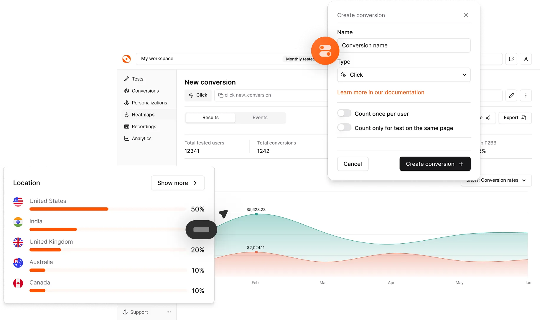
Conversion Rate Optimization is it’s own profession - and to become an expert, you need years and years of experience through trial and error.
I’ve been a web designer for almost 10 years, and a lot of that time has been spent focusing on conversion rates. While I can’t pass all that knowledge on to you in one video, there are some major things that I see most sites doing which hurt their conversion rate - and in this video, I’m gonna share them with you - that way, you can hopefully remove the main issues.
.jpg)
You care a lot about your business - it means everything to you.
Visitors on the other hand? They see your business as a potential solution to their problem, and if you can’t convince the quickly, they’re gone without a second thought.
It sounds obvious, but most websites I come across seem to have missed this point.
Take a look at your website, and look for copy that starts with ‘Our’, ‘We’re’ etc. This self-centered language is meaningless to your visitors.
We have a whole video talking about this exact point - and if your website is filled with self-centered copy, I recommend checking it out, as this is both one of the biggest killers of conversion rate, and one of the easiest ones to fix.
Like I said, visitors are hoping your product can solve their problem - and at this point in time, we all want instant solutions.
So then, tell me, why are you making your visitors contact you before trying their product?
If you have no self-serve option, you are killing your conversion rate. End of story.
However - some SaaS products, especially enterprise-focused ones, do not have a self serve option as each customer pays a custom price.
If you are in this position, your website has an even bigger job to complete - you must still givve your users a way to confirm whether or not your solution is right for them, even if they can’t sign up on their own. I’m talking demo videos, sandboxes, etc.
Personally, if I’m not 100% sure a product is right for me, I’m not going to waste my time booking and then attending a demo.
Yeah, I know, this one is obvious - but it’s also so often overlooked.
If your site takes 3 seconds to load, you’re instantly going to miss out on a lot of conversion.
Before anything else - make sure your site is performant, not only for you and your M4 Macbook with 500mbps internet, but also for normal people with weak machines and slow internet.
If you have this problem, fixing it is the single most impactful thing you can do to start converting more customers.
Assume the absolute worst of your visitors. It sounds mean, but truly, imagine everyone going on your site has the attention span of a 3 year old iPad kid with ADHD.
If you’re asking them to enter first name, last name, email, phone number, password, password confirmation, and so on before they even click next - yep, you’re gonna lose a ton of those iPad kids.
Ideally, make your signup flow less intensive - but, I understand very well that sometimes you NEED all that info. If that’s the case, my recommendation is to start with nothing but email and then let them click next - then, go step-by-step. This makes it easier for short attention spans to stick around, and if they don’t, you’ve at least captured their email address and you can reach out to them for a follow up.
BONUS: Add social auth such as Google, Facebook, and Apple. This one-click signup process is superior and visitors have come to expect it, so you’ll immediately convert more by simply adding social auth.
As users, we’re looking to see if your product will solve our problem - and even if your site does all of the previous things perfectly, we’re still wondering what will happen if it doesn’t.
Even if your product seems perfect, if it’s not immediately clear that there is no risk, I’ll probably go back and try to find a competitor that I feel has no risk.
In practice, this often means making it very clear on your site that you have a no-questions-asked refund policy.
Even if you can’t offer 100% refunds, make sure your website clearly states what will happen if the user realizes the product is not a good fit.
So - this is by no means an exhaustive list, however, I can confidently promise you that dealing with all 5 of these things will lead to you having a significantly higher conversion rate.
If you’re a SaaS company, your website doesn’t get unlimited chances. Every hesitation, every extra field, every slow second, and every unclear message pushes people toward a competitor that feels easier, faster, and more trustworthy.
None of these fixes require a full redesign or months of work. They’re simple changes that compound into a meaningfully higher conversion rate over time.
Dial in your message, remove friction, give people a way to try or evaluate your product quickly, and make it clear there’s zero risk in giving you a shot. Do just these five things well, and your site will already outperform most SaaS competitors.
If you want to go even deeper and validate every improvement with real data, A/B testing with tools like Optibase will show you exactly what works—and what doesn’t.